Understanding
Analyse how your bot understands what your users say.
Learn how well your bot understands what the users say.
General
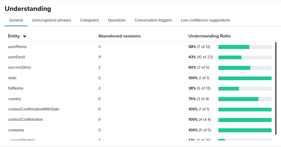
The table shows the names of all entities you have defined in the cognitive flow as rows. For each entity there is information about:
- the number of abandoned sessions — in how many conversations the users stopped responding after the bot asked about that entity. In the example, 11 conversations were abandoned when the bot asked about userEmail. This could mean a couple of things - a) the bot did not understand the email provided by the user, or b) the user did not give an email and abandoned the session.
- the understanding ratio — how many times the bot was able to understand the answer provided by the user as the proper entity type. In the example, the bot correctly extracted an email value in 10 out of 23 total conversations that had a step with the userEmail entity. That makes for a 43% understanding ratio, which is not very good. To improve it further you will have to check some actual conversation logs from the History screen in the NativeChat web portal. This should give you an idea of why in 57% of the cases the bot has failed. People could have said something unexpected as email format, or maybe they didn’t want to respond with an email but asked something different.
Use this information to improve the training data of your bot so that it can recognize user input in more cases. Or make adjustments in your conversation flow if the questions the bot asks are not expected by the users. It could be that they don’t want to provide the answer the bot asks for because the question doesn’t make sense to them.
Unrecognized Phrases
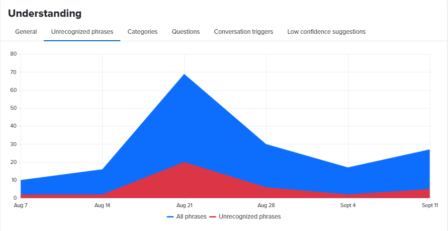
The chart shows the number of the user phrases the bot could not understand and the number of all phrases over a period. Ideally, the number of unrecognized phrases should be near 0, a downward trend means that your bot is getting better at understanding and an upward trend means that the bot is getting worse at understanding.
Categories
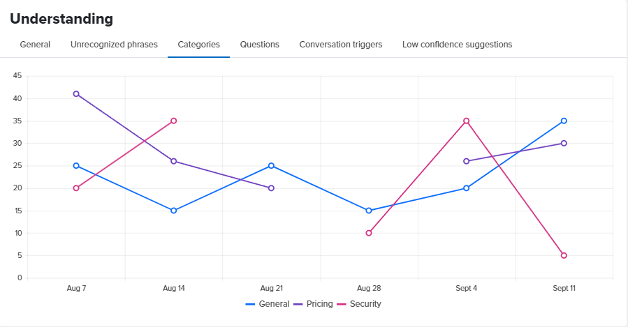
The chart shows QnAs understood for a period distributed by category.
In the example above, in the week that starts on Sept 4, the bot did understand 20 user phrases as QnAs from the General category, 26 user phrases as QnAs from the Pricing category and 35 user phrases as QnAs from the Security category.
Questions
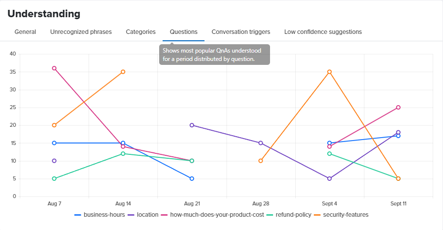
The chart shows QnAs understood for a period distributed by question.
In the example above, in the week that starts on Sept 4, the bot did understand 15 user phrases as a question about business-hours, 5 user phrases as a question about location, 14 as a question about how-much-does-your-product-cost, 12 as a question about refund-policy and 35 as a question about security-features.
Conversation Triggers
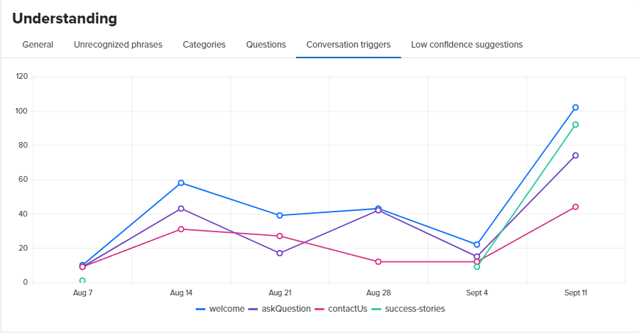
The chart shows conversation triggers understood for a period distributed by conversation.
In the example above, in the week that starts on Sept 4, the bot did understand 22 user phrases as the welcome conversation, 15 user phrases as the askQuestion conversation, 12 user phrases as the contactUs conversation and 9 user phrases as the success-stories conversation.
Low Confidence Suggestions
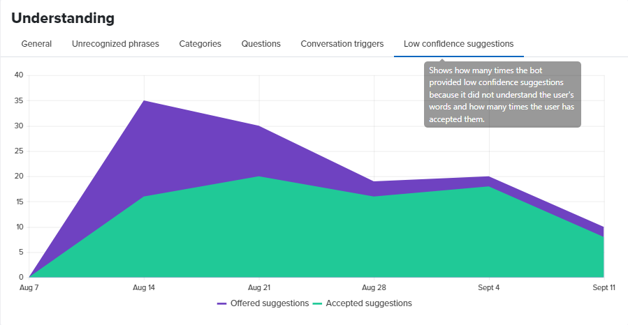
The chart shows how many times the bot offered low confidence suggestions to the user because it did not understand the user phrase with enough confidence and how many times the user has accepted an offered suggestion.
Somethings missing or not clear?
Ask a question in our community forums or submit a support ticket.